In The Markdown Mindset I described how I use a variety of different editors to write Markdown in different contexts. I also use different fonts and color schemes to help me differentiate as I go along.
For the record, everything was done in Monaco a few years ago.
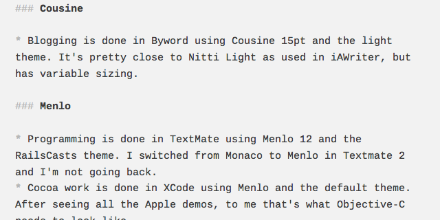
Cousine
Blogging is done in Byword using Cousine 15pt and the light theme. It’s pretty close to Nitti Light as used in iAWriter, but has variable sizing and is free from Google. I really like it in Byword because they render the font a tad large and it matches their cool anti-aliasing scheme.
Menlo
Programming is done in TextMate using Menlo 12 and the RailsCasts theme. I switched from Monaco to Menlo in Textmate 2 and I’m not going back. Monaco’s line spacing in TM2 was too tall, Menlo is just right.
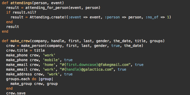
Cocoa work is done in XCode using Menlo and the default theme. After seeing all the Apple demos, to me that’s what Objective-C needs to look like.
Long form writing in Scrivener is done in Menlo as well now. I really do not like the default Optima. I used Cousine for a while until one day I tried Menlo and it just looked smoother.
My terminals are also set up to use Menlo, and I use a custom theme that integrates cyan and yellow into the prompt and ls colors.
Consolas
Note taking is done in BBEdit using their tweaked version of Consolas and the default theme (I have set up RailsCasts for code files as well). Something about working in BBEdit makes we want to use Consolas and get that old-mac editor look.
So bye bye Monaco, my old friend. You served us all so well for so long.